As soon as it was announced that the historic, newly renovated LaFayette Hotel reopened, the airwaves started buzzing.
Ten chat threads of mine were all popping off simultaneously. “Have you been yet? Is it nice?”
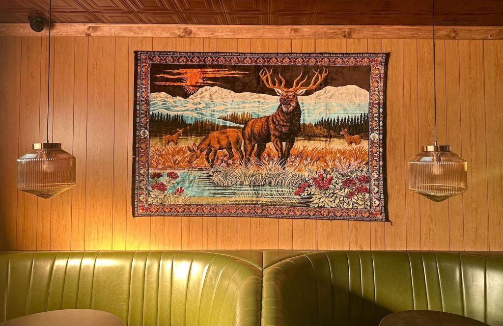
Spoiler alert: It is nice. Really nice. This is the hotel’s first renovation since its construction in 1946, and the new version’s got custom everything: art pieces from CH Projects founder Arsalun Tafazoli’s own downtown home, lush textiles, vivid wallpaper, plush beds, decadent food. It has a pool harkening back to the days of old Hollywood, a few good bars and restaurants, and an antique-styled bowling alley à la There Will Be Blood.
Just as important is what The LaFayette Hotel doesn’t have, namely room service and televisions, since guests are meant to spend time mingling. And what it hasn’t got yet, but will soon—a subterranean, 1960s-esque supper club called Lulu’s and a Turkish bath–style spa—is sure to be the cherry on top of the $31 million renovation cake. It’s still a work in progress. But the bones are there, and from a design standpoint, they’re strong.
The LaFayette Hotel’s design was conceived in collaboration with Brooklyn-based Post Company, which also helped create the hotel’s custom finishes, like the rooms’ botanical goth wallpaper and The Gutter bowling alley’s plaster cast ceiling, alongside the hotel’s owner, Tafazoli, and his team. Tafazoli has a strong point of view and a deep personal connection—call it an obsession—with every design element, from the giant Atlas globe in the lobby bar to the custom guides to San Diego that appear in every room (full disclosure: our Chief Content Officer Troy Johnson penned that guide. You’ll recognize the prose when you see it).
Tafazoli’s properties are all reflective of his good taste. In-house at CH, Tafazoli has the Department of Interior, a “small army of six people” who help bring his fantastical visions to life. “Execution is a very difficult thing,” he tells me. “Every piece was custom sculpted, and we had to sort of figure out how you could get all modern building infrastructure into pieces we created.”
To add to the challenges, The LaFayette Hotel is on the National Register of Historic Places, so CH is required to build and design with the time period in mind and have plans approved by the Register. The result is a whimsical reimagining of what the property must have been like in its heyday.
Would he do it again? Is CH a hotel company now? Tafazoli looked overwhelmed as soon as I asked, letting out a big sigh. He had just gotten done telling me how much “brain damage” all of this had caused. He thinks for a second—then assures me that CH is a San Diego-focused company, so any expansion will stay here. Restaurants are always part of the game. But more hotels? “That’s not really up to us to decide,” he says. “If people like it, and the work resonates, then that gives us the opportunity to continue to do the work.”
Below, Arsalun Tafazoli shares his vision and inspiration for the LaFayette Hotel’s design and decor in his own words:
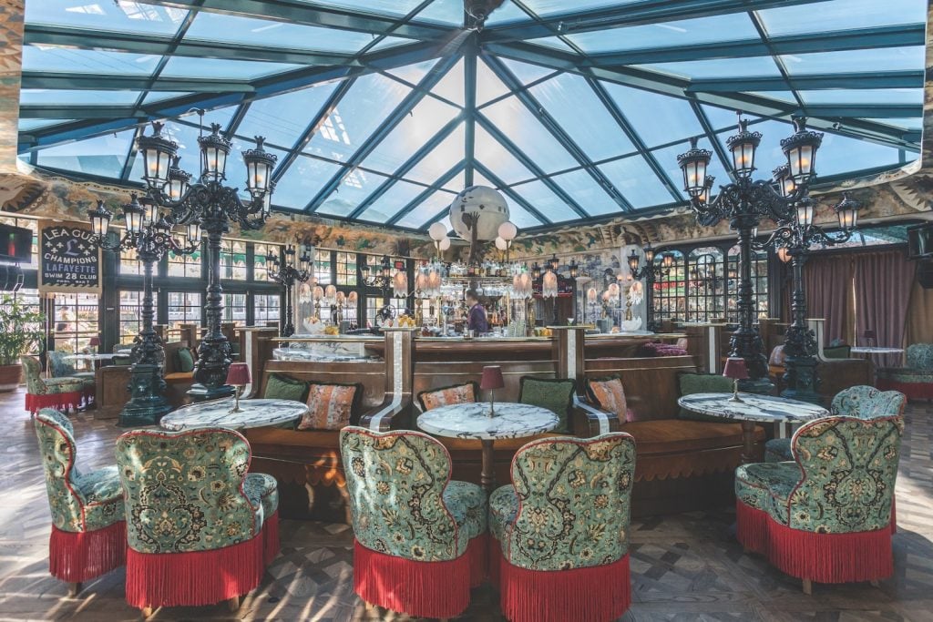
“The fringed chairs in the Lobby Bar use fabric from House of Hackney. The mural that wraps around the bar was painted by Brazilian artist João Incerti. The custom Atlas sculpture that anchors the room at the center of the bar is filled with hidden symbolism, referencing everything from Wu-Tang to my late dog.”
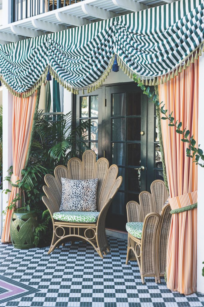
“We had custom fabrics and umbrellas made for the pool. This is a pretty historic space, and we wanted to keep the core of it. The cabana rooms are a big part of what makes the property special. It’s a special experience to have direct access to the pool in that way, and it makes for a pretty immersive environment. We thought about the flora and fauna that surround the pool and how they incorporate a level of escapism.”
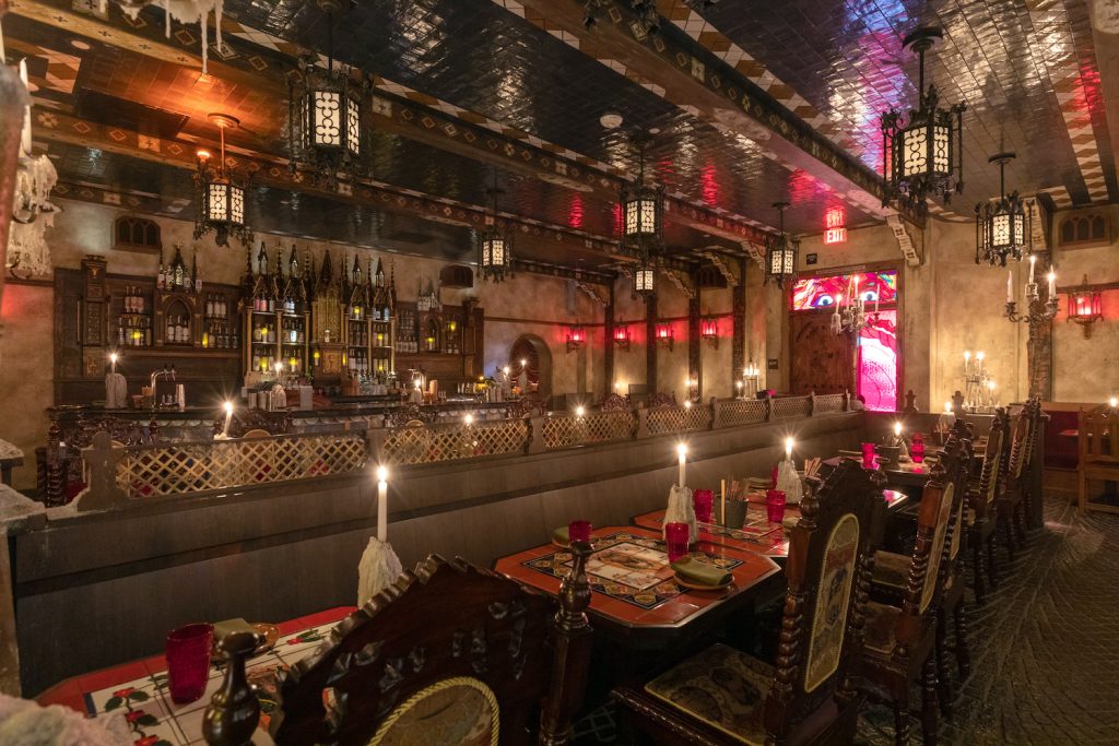
“[Oaxacan restaurant] Quixote was fabricated using elements sourced from a deconstructed church. We consider this space a place of agnostic worship. One side of the restaurant is the dark altar and one is the light altar, and they represent each side of us.”
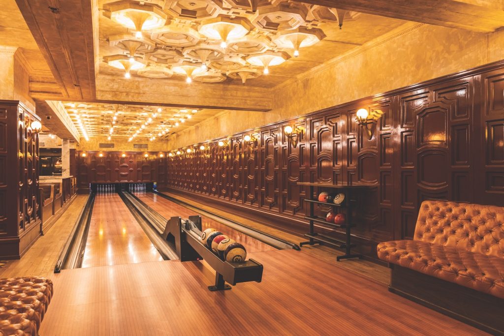
“The Gutter was designed based on archival photos of Henry Frick’s personal bowling alley at the base of the Frick Museum in New York. We wanted to recreate it true to period. This room is also inspired by the final scene of the film There Will Be Blood.”
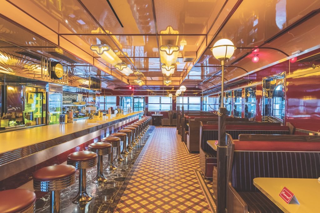
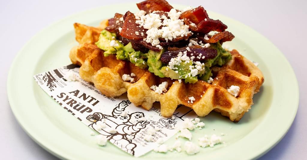
“Beginner’s Diner is a true historical recreation of a 1940s diner—even down to the dimensions of the booths. Everything is custom and made by hand. We were also inspired by the Double R Diner from Twin Peaks.”
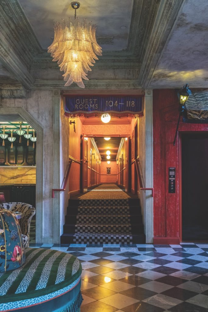
“For the lobby, we wanted to do something that felt timeless and not hyper-relevant. The classic checkered flooring is an ode to the Ritz in Paris and other famous hospitality institutions around the world. Checkered floors are rooted in tradition, but the palette is updated. We made it our own by playing with color.”
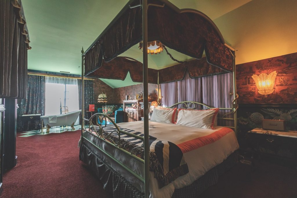
“We put bathtubs in the ultra-luxe rooms because we’re fans of a nice bath. Also, these rooms were designed with a sense of intimacy and we imagined them as a place to share with someone you’re close with. There’s a particular mark in a relationship when you can use the bathroom with the door open. So why not put a bathtub in the middle of a luxurious room you are going to share with someone special?”
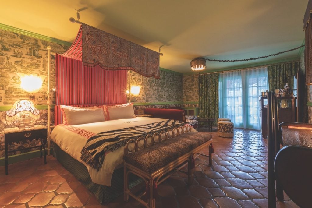
“The poolside rooms feature custom Moroccan terracotta tile. Fundamentally, the rooms have the same design as those in the main building, but they use a different color palette and materiality—we had to make them more durable and waterproof. There are references to pool culture, reflecting the sun and San Diego, utilizing brighter tones.”
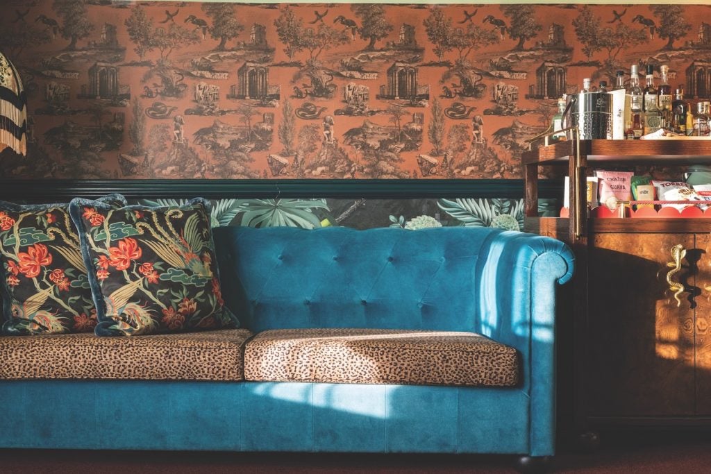
“The patterned wallpaper in the rooms was hand-drawn by Dane Danner and made in collaboration with Post Company.”
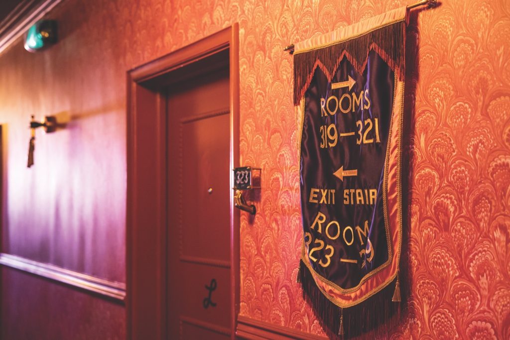
“The silk embroidered banners were made by artist Meghan McAleavy. The hallway wallpaper was designed in-house [by the CH Projects Department of Interior], and all the room numbers were custom-made, as well. We wanted the hotel to have a deep sense of history and tradition. There is a sense of familiarity, but also, you can’t quite place it. There are a lot of custom details in all the corridors. We really tried to create a place where you can get lost and find little new details every time you come back.”
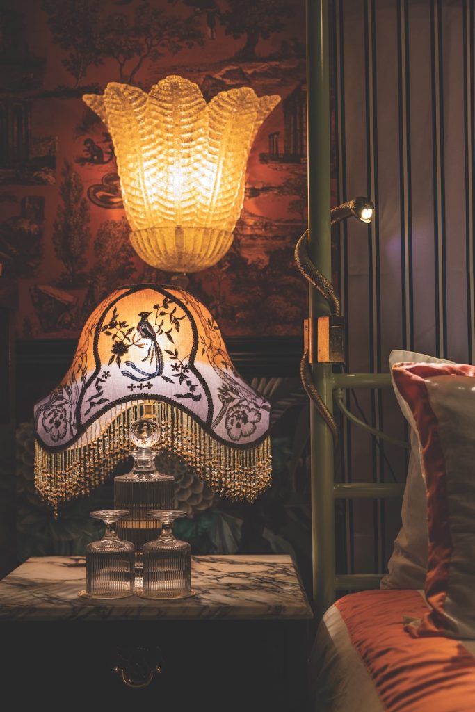
“The sconces are custom glass made special for the hotel. The snake reading lamps are symbolic and represent a protector on your shoulder, but could also be interpreted as a devil on your shoulder. The theme of snakes permeates throughout the property. Snakes and serpents are probably the most significant animals in literature and mythology.”
“They can be seen as protectors and/or dangers, darkness and light, good and bad. They also have the ability to shed their skin, and that is powerful—they represent aspirational qualities such as transformation, renewal, forward growth, resilience. Also, in terms of design [at CH Projects], we never want to be neutral, and there is never a neutral reaction to a snake. People either love them or are disgusted by them. They represent the best or the worst sides of us.”
